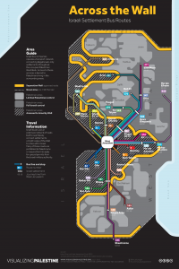
 In an old post about the potential political capacities of the infographic, I wrote: “If Guy Debord was right in highlighting that social relations between people are increasingly mediated by images and representations, then can the infographic be a popular source of demystification?” Can “the image” be both the condition of our alienation as well as the possibility for a more critical political disposition? Electronic Intifada has a very brief interview with Ahmad Barclay that got me thinking about this again. Barclay is an architect who works on research and visual direction with Visualizing Palestine—a group that “uses creative visuals to describe a factual rights-based narrative of Palestine/Israel.” Barclay says, “Possibly the main driver in what we’re doing is, there’s not a lack of information about Palestine — that’s clearly not the problem.”
What’s particularly interesting for me about the infographics of Visualizing Palestine is their necessarily spatial and territorial dimensions. Images are powerful vehicles for communicating political ideas about space (obvious example: maps—the original infographic?). “Across the Wall,” for instance, shows the bus routes connecting Israeli settlements on either side of the wall. The mundane design qualities of a transit map becomes a jarring revelation of social-spatial segregation, im/mobility, and confinement (détournement?). It even has travel times between the various settlements and West Jerusalem. “A Policy of Displacement” breaks through the mind-numbing, eye-glazing nature of statistics by communicating the spatial scale of housing demolition and the amount of people displaced by this policy of dispossession. The list could go on (Water, Segregated Roads Typology, Checkpoint Births…)
