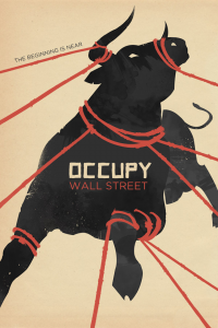
 Besides being a personal obsession of mine, poster art has a long history in radical movements for social change. I’m particularly interested in how images and art are able to communicate AND generate solidarity across social and geographical divides. One of my favorite compilations of revolutionary poster art is the collection compiled by Lincoln Cushing, a Havana-born librarian and archivist, titled ¡Revolución! Cuban Poster Art. I particularly like the portion of the book that focuses on the posters—I include some I grabbed online in the gallery below—produced by the Organization in Solidarity with the People of Africa, Asia and Latin America (OSPAAAL). Cushing has also has published other beautiful (and very affordable) collections: Visions of Peace & Justice: 30 Years of Political Posters from the Archives of Inkworks Press (2007); Chinese Posters: Art from the Great Proletarian Cultural Revolution (2007); Agitate! Educate! Organize! – American Labor Posters (2009).
[scrollGallery id=5]
Now, the nice people over at the Occupied Wall Street Journal have exclusively dedicated their fourth edition to highlight the #Occupy movement’s striking Poster Art. I think the poster art makes it official: it’s a movement. The posters were compiled by the Occuprint Lab, which is a collaborative effort of the OWS Screen Printing Guild—the group that’s been printing patches and clothing at Liberty Plaza for over a month. I’m going to send over some of my own. In the gallery below are some of my favorites, for the full (and growing) compilation see the Occuprint page.
It’s hard to overstate the power the image has had in the movement. I just read the NYT article on Kalle Lasn from Adbusters, the people who brought us the ballerina dancing on the bull. Lasn told the NY Times, “There’s a number of ways to wage a meme war” (think: ballerina, Sgt. Pepper (aka. Lt. Pike), the hash-tagged #occupywallstreet). “I believe that one of the most powerful things of all is aesthetics.”
Lasn adds, “If you’re able to come up with a very sexy sounding hash tag like we did for Occupy Wall Street, and you come up with a very magical looking poster that seems to have something very profound about it, these devices push these memes, these meta memes, into the public imagination in a very powerful way.”
Couldn’t agree more.
[scrollGallery id=6]

Pingback: The aesthetics of protest: how Occupy sees itself (updated Dec 8, 2011) « typologica
Pingback: The aesthetics of protest: how Occupy sees itself (chapter one) | TYPOLOGY
Pingback: TYPOLOGY | The aesthetics of protest: how Occupy sees itself (chapter one)
Enjoyed your Article on The Occupy Poster art. Keep up the Great Work.