 So there’s been a lot of interesting infographics published recently that help visually represent a host of contemporary issue and crises: from Euro Debt, U.S. income inequality, and the increasingly consolidated power of corporations and banks, to the Afghan quagmire and the Pentagon’s gear acquisition and management logistics. A few of these have gotten traffic on listserve I like and through Facebook, but I figured it’d be worth putting them together in a single post.
If Guy Debord was right in highlighting that social relations between people are increasingly mediated by images and representations, then can the infographic be a popular source of demystification? Like “everyday life” is the image both the condition of our alienated existence as well as the possibility of de-alienation and critical political consciousness? Debord claimed, “The spectacle is not a collection of images; it is a social relation between people that is mediated by images.” Can the infographic cut through the cloudy mist and shed some light? Let’s examine. Click on the images for closer-up looks and how we got into this beautiful mess.
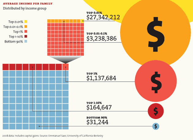
Income Inequality in the United States
This image from Emmanuel Saez at UC Berkeley was published by Mother Jones, along with a lot of other related and really nice infographics. Here’s the 1% vs. 99% in all its glory.
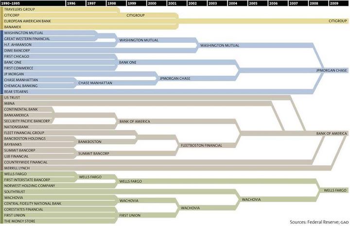
Corporate Power: Consolidating Banks and Companies
Below are two images. The first, taken from the New Scientist, depicts the tiny and dense capitalist-corporate network that rules the world. An analysis of the relationships between 43,000 transnational corporations by a group of researchers in Zurich has identified a relatively small group of companies, mainly banks, with disproportionate power over the global economy. The research found that a core of 1,318 companies with interlocking ownerships (see image)—representing 20% of global operating revenues—essentially own the vast majority of corporations. From this 1,318 elite group, researchers discovered a “super-entity” of 147 even more tightly knit companies.
The second image on the consolidation of the banking sector—the captains of the captains of capital—is even more visually striking. It begins in 1996. Remember Debord: “The spectacle is capital accumulated to the point that it becomes images.” (I realize I’m not really getting at what he meant, but who cares? The point is that visual representations of capitalism are powerful tools of critique and demystification.)
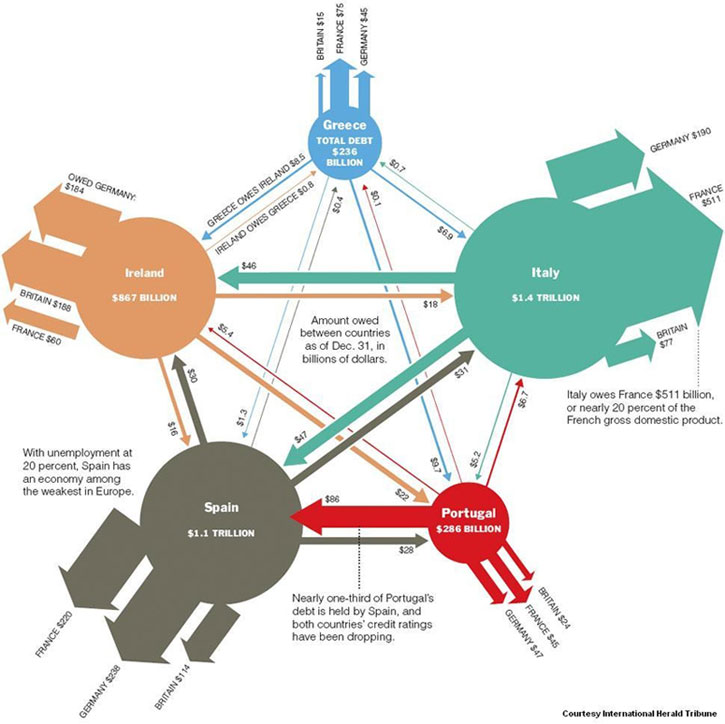
The European Debt Crisis
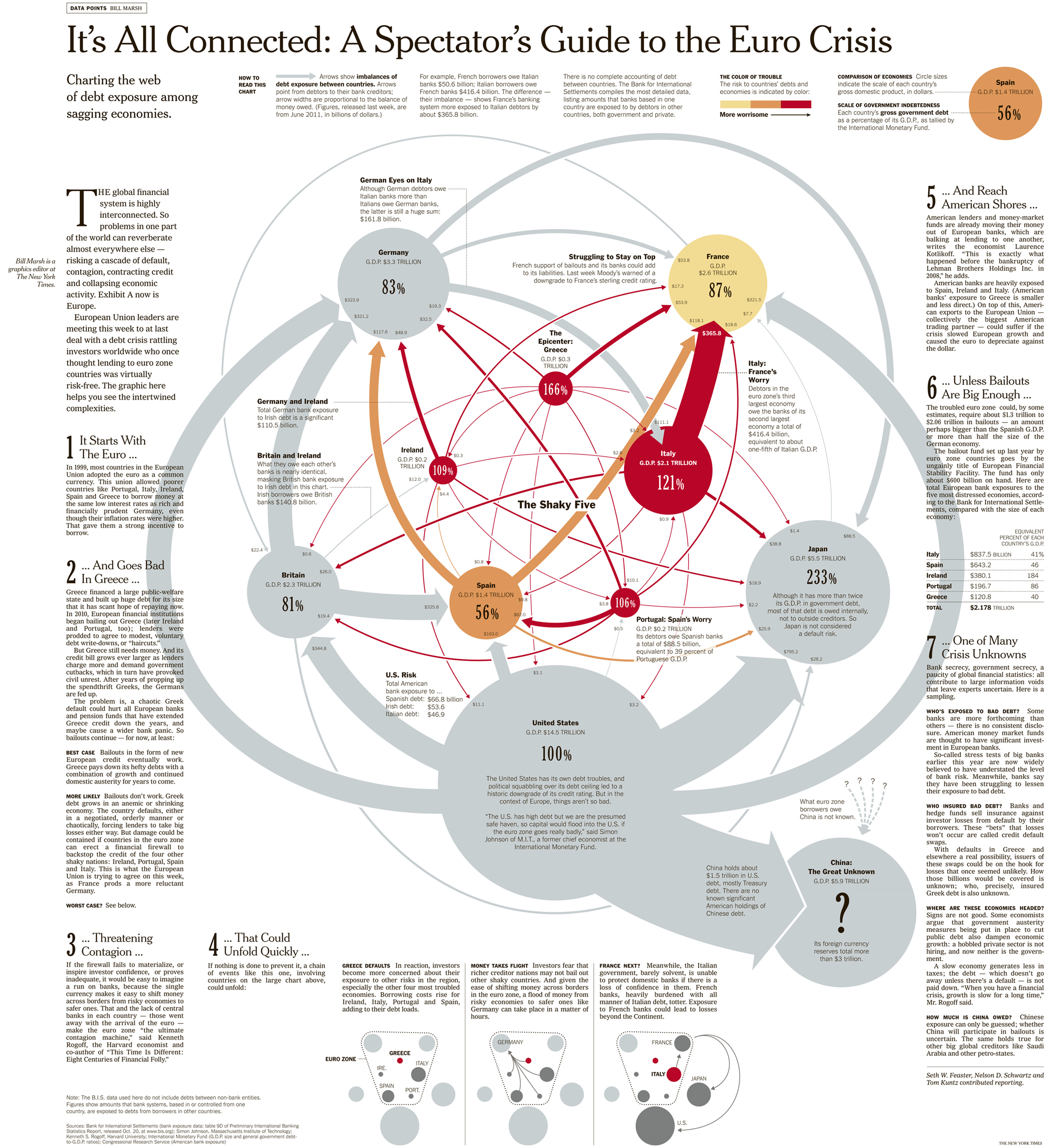
From the New York Times, we get two interesting infographics represent the growing Eurozone crisis—also known as the “Great Euro-Ponzi Scheme.” (Say “Euro-Ponzi” three times really fast under your breath. Ok good.) Here’s the breakdown of this teetering house of cards:
The NY Times’ Bill Marsh at “Data Points” has a set of good graphics summarized in this print version. (The interactive Flash on the NYT is worth playing around with and makes it all more comprehensible.) Note the title: A *Spectators* Guide…
As for the Occupy the Shit Out of Everything movement (a.k.a. Occupy X), remember Debord’s prescient remark: “Proletarian revolution is this critique of human geography through which individuals and communities could create places and events commensurate with the appropriation no longer just of their work, but of their entire history” (Thesis 178).
The Pentagon’s Unruly Visual Quagmires
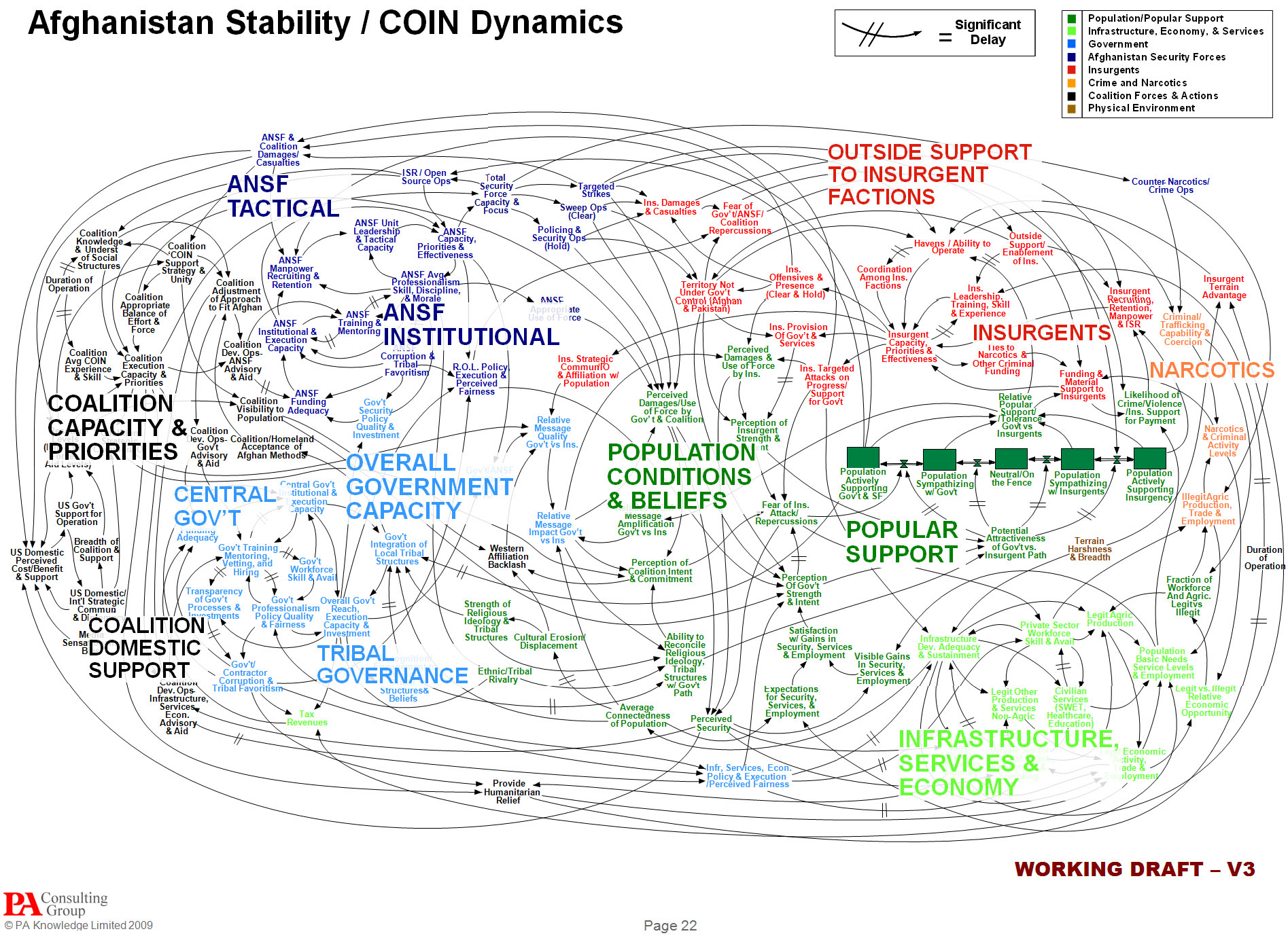
The classic is, of course, the PowerPoint slide of the Afghan war, showing how the Pentagon “thinks” about stability and counterinsurgency (COIN) dynamics. U.S. Afghan war commander Gen. Stanley McChrystal famously quipped, “When we understand [the slide], we’ll have won the war.”
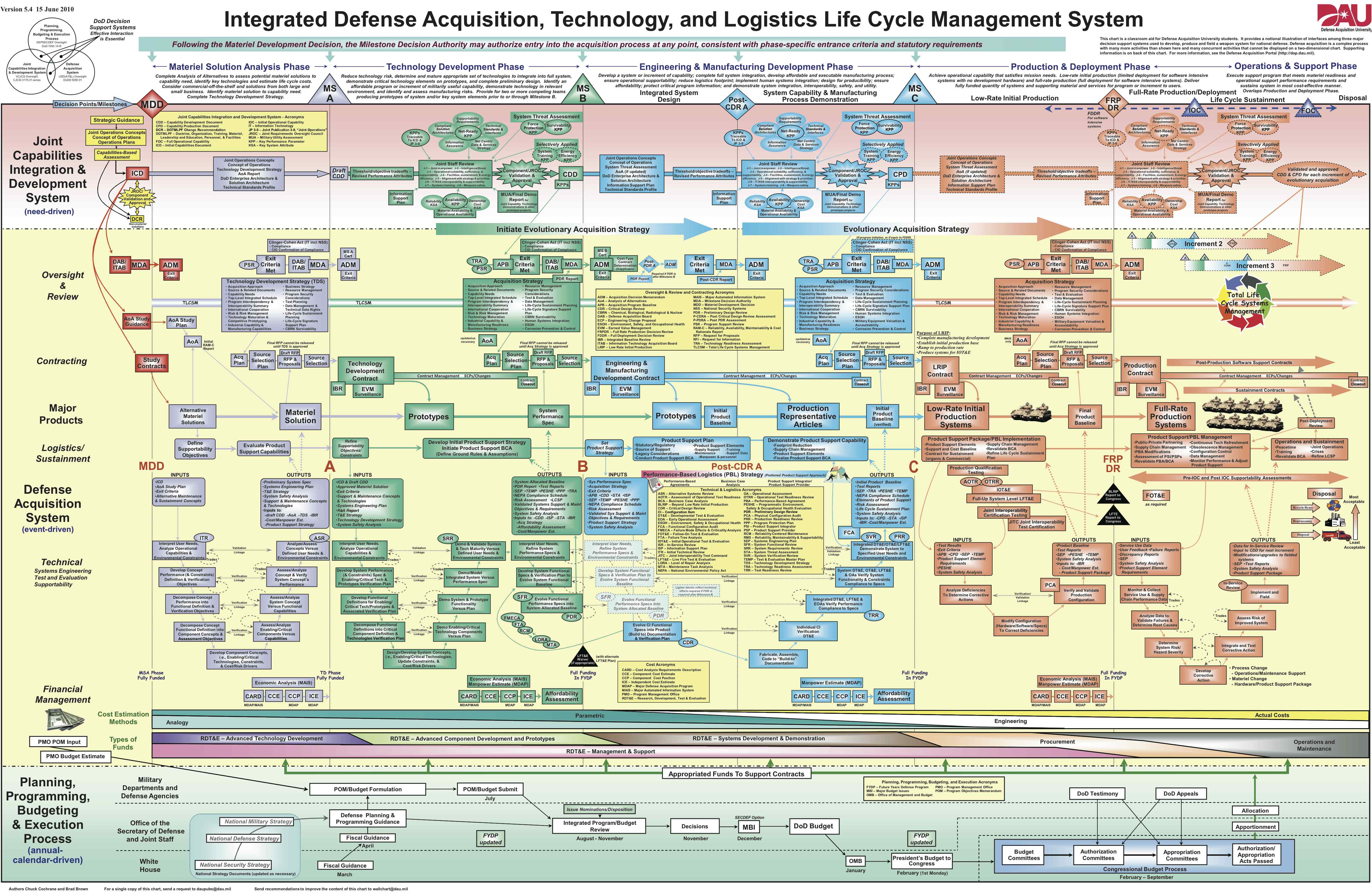
Finally, we have another “beauty” of a mess; it’s a three-foot-tall wall chart hanging somewhere in the Pentagon outlining how the U.S. military handles the acquisitioning and management of its gear. Wired‘s Danger Room notes, “The chart is put out by the Pentagon’s Defense Acquisitions University, where the Pentagon educates 180,000 people a year on its, um, unique process for purchasing equipment.”
For those interested: Check out Visual Complexity and Social Design Notes—two sites that get me thinking about these issues.


Pingback: Graphics for OWS and elsewhere | Progressive Geographies
Chortled and cried.